I have been an avid tumblr user since my high school days, but my love affair with it has strictly been on the desktop. I’ve always avoided the mobile app since it is notorious for having numerous bugs and does not allow as much control as it does on desktop.
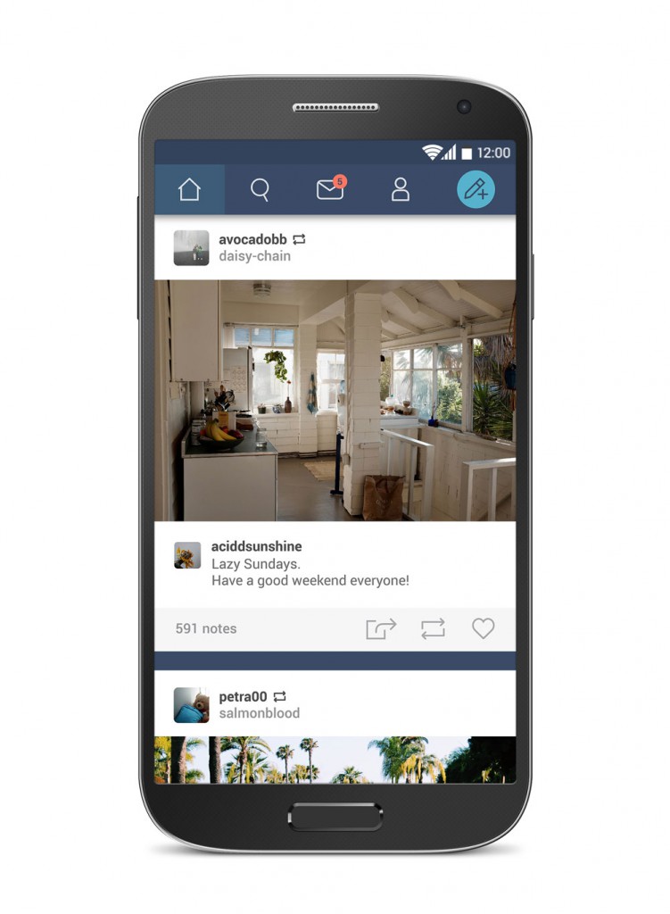
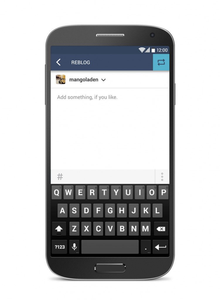
My purpose in this redesign concept is to create a more seamless and user-friendly blogging experience that optimizes tumblr’s key features. In addition, the iconography is also reworked for a modern, clean look. This fully integrates the elements of the app with usage of white space for a less cluttered feel. (Design is meant for Android and is undertaken as a personal project.)

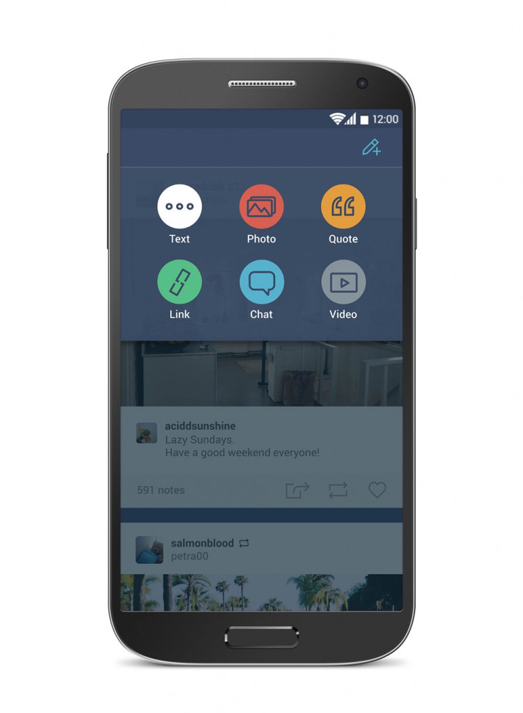
In terms of functionality, the icons have been made bigger in size as I often find myself accidentally tapping the wrong thing in the current app. The ‘create new post’ button is moved to the top right, integrating it with the nav bar and making it in line with the desktop version.

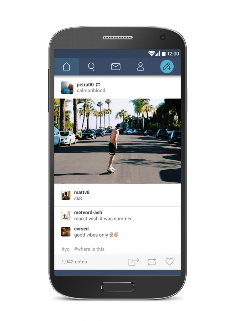
Images in individual posts are made to span the entire width of the screen for better viewing experience. Distinction is made between the poster’s comment and other comments, as there is a problem on tumblr with deleting comments from the original post and changing sources. This would ensure that credit is given to the original poster.
The like, reblog and share buttons are kept on the bottom of the post because I find that a user’s willingness to like or reblog a post depends on not only the post, but also the comments, as it is often a big part of the post itself. As such, it is essential to have these functions at the end of a post, so that the user would not have to scroll back up once they have finished reading it.

